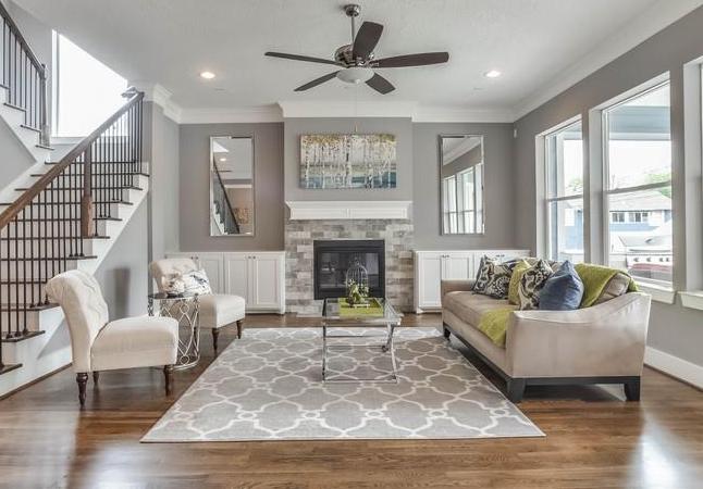
Fads from the 1980's & 1990's to Remove Before Selling
By Networx.com | At Home – Wed, Aug 15, 2012 1:41 PM EDTBy Linda Merrill, Networx
There is no question that decorative fashion and trends come and go. The hottest trends today will start to fade in a year or so and by 2025 and beyond most will be looking tired and out of date. When you are selling your house, "old" and "out of date" are not good messages to be sending. While intellectually we all understand that the furnishings are not staying and most decorating such as paint or wall coverings can be changed fairly easily, our emotional brains take over when evaluating a property. When we see things we don't like because they seem old, dingy or outdated we start wondering more about the things we can't see and how old they might be as well.
Today's empty-nesters were in their "up and coming years" during the 80's and 90's, when careers were settling in, families were growing and homes were purchased and decorated. In the intervening decades, those freshly decorated spaces have aged, and quite frankly, they haven't aged very well. Here's a list of the seven biggest offenders of 1980's and 1990's home decorating that sellers should consider removing or replacing when preparing the house for market:
1) Dense floral wallpapers and fabrics: For a long time, wallpapers were actually quite taboo in home decorating, specifically stemming from papers used in the 1960's to the 1980's. One of the biggest design trends in the 1980's were dense floral wallpapers with the pattern carrying over to the fabrics on the windows and furnishings. Nothing says the 1980's faster than a riot of roses coming at you from all sides. Slipcovering the furniture or replacing the wallpaper will relieve the overwhelming feeling of age.
2) Wallpaper borders: Along with floral wallpapers was the heavy use of decorative wallpaper borders, which were applied at the ceiling, as a chair rail or on top of the baseboard, sometimes all three at a time. As homes became larger during the period, we were seeing less fine detail such as crown moldings or paneling. Paper borders were used as a cheap and cheerful alternative but aren't very much in use today. It is best to remove all the borders and simply paint the walls.
3) Overwhelming pattern and texture: In the 1980's and 1990s, we saw a lot of mixed patterns and colors in our interiors. There was a lot of visual stimulation going on. This can include lots of different fabrics used in a single room, the use of mixed decorative tiles in kitchens and bathrooms and even the ubiquitous sponge painted walls. Too much pattern is overly stimulating and we don't know where to look when faced with it and buyers may be less likely to spend time in a room that is too visually cluttered. Today's style tends to be simpler with fewer colorful and textural elements. Replacing most of the older materials with solid colors, or simpler patterns will bring things up to date.
4) Brass hardware: Unless it's of exceptionally high quality, brass fittings such as doorknobs, drawer pulls, hinges, electrical back plates and faucets do not stand the test of time. Most become discolored and even pitted or rusty, depending on the location. While we have seen a recent spike in the use of brass or gold-toned metallics in the home, the safest choices remain matte or shiny stainless steel, nickel or chrome fixtures and knobs, simple ceramic pulls and electrical plates that match the wall coverings. Most of these are easy to switch out and will make a world of difference.
For an example of how much of a difference replacing outdated brass fixtures makes, check out thisHometalk.com post detailing the overhaul of a 1980's kitchen. Note the brass chandelier; then note how much more modern and attractive the new light fixture is.
5) Overstuffed furniture: In the category of "bigger-is-better" was the overabundance of sofas, loveseats and chairs-and-a-half with the really fat rounded arms. Not only are these now out-of-fashion, they simply take up too much room in a space thus reducing the feeling of spaciousness in even the most generous rooms. Again, not the impression one wants to be projecting to the homebuyer. It's rarely even possible to purchase slipcovers for these gargantuan pieces. If you're selling, it is time to toss or donate and either purchase new (to be used in your new home) or rent some suitably subdued replacements.
6) Wall-to-wall mirrors: Mirrors are a fantastic way to create a feeling of spaciousness and light in a room (when used well). However, the days of floor to ceiling mirrored closet sliders are pretty much over. It's best to remove the mirrors and repaint the doors underneath, or replace the doors altogether.
7) Carpet in the bathroom: One wonders really how this was ever popular, but for a while carpeted bathrooms were done. The first rule of home staging is that cleanliness sells and there is no way that a twenty-year old wall-to-wall in a bathroom will ever look or feel clean. Today's bathrooms are spa-like in their Spartan cleanliness with little use of fabric at all. Rip out the carpet; new linoleum is a better choice if wood or tile isn't in the budget.
Linda Merrill is an interior designer who works with Boston-area painting contractors and Boston-area remodeling contractors.
Via Shine from Yahoo
For a consultation on how to update your home for selling contact Redesign Etc. Home Staging

No comments:
Post a Comment